Hello Sir,
For over a decade, we have followed the principles of growth cum value investing and it has worked quite well for us. However basic chart reading skills have often helped us plan our entries and exits in our fundamental research based stock picks.
Today we will share with you the basics of chart reading. In this blog, we will explain what a candlestick chart is and what a candlestick means. We hope you understand that chart reading is a soft science and it can be used only as an indicator.
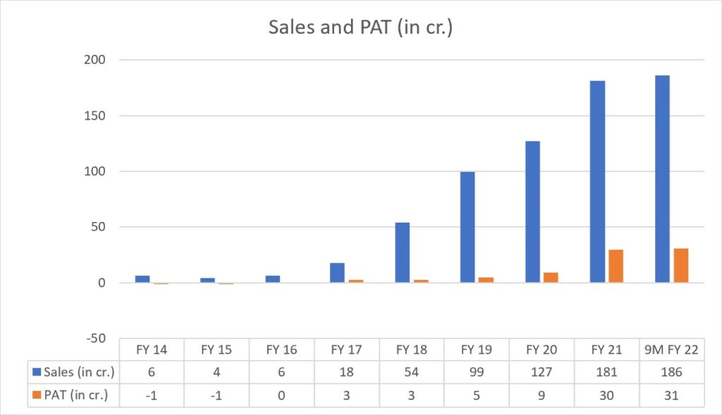
Before that, if you are interested in investing in a branded processed foods company that has reported 9x growth in sales and 9x growth in PAT in just 4 years (refer below chart data) in its US business and still available at 10 times next year's earnings, you can read about it here - LINK
Origin of candlestick charts - Candlestick charts are believed to have been developed in the 18th century by a Japanese rice trader, Munehisa Homma. They became famous after Steve Nison published his book ‘Japanese Candlestick Charting Techniques’ in 1991.

This is what a candlestick chart looks like -

In this chart, the Y-axis represents the price of the stock or any asset and the X-axis represents the time period. Each candlestick represents a particular time period. If you open a daily chart, then each candlestick will represent a day and if you open the hourly chart, then each candlestick will represent an hour.
Now let us understand what these candlesticks mean?

In the above image, the green/red part of the candlestick is called the body and the lines above and below are called the upper shadow and the lower shadow.
Let us suppose that this candle represents 1 single trading day. This means that in the case of the green candle the stock's opening price is shown by the lower part of the body and it’s closing price is shown by the upper part of the body.
The bottom of the lower shadow represents the lowest price at which the stock traded on that particular day and the top of the upper shadow represents the highest price at which the stock traded on that particular day.
In the case of the red candle, the opening price is shown by the upper part of the body and the closing price by the lower part of the body.
You can find the candlestick charts on websites like trading view, chart ink etc.

Above image is a screenshot of the Trading view. It is a weekly chart of Asian Paints. In this chart we can see that on the week starting on 17th Jan, the stock opened at ~3360. The stock made a high of ~3400 and a low of ~3220 in that particular week. Finally the stocks closed at ~3280. As the closing price is lower than the opening price, the color of the candle is red.
We hope you would have understood what a candlestick means and how you can read a candlestick chart. In the next blog we will learn how to use some past patterns and tools to make sense of these charts.
Until then check out this image to understand what different types of candlestick formations could represent.

If you are looking for investment opportunities do check out our premium subscriptions. We have been helping our clients build wealth using equities for over a decade now.
Best Regards,
Archit Mehrotra